Back to gallery

Hospitality / Bar & restaurant

Prohibition

One address, with several different ways to spend the evening.

Prohibition homepage in a MacBook Pro display

The starting point

A website built around
the customer’s decision.

A venue with multiple rooms needs to help people choose the setting that fits their occasion. The website must work for a dinner guest and someone planning a private event.

The thinking behind the design

Details with a purpose.

01

Make the building recognizable

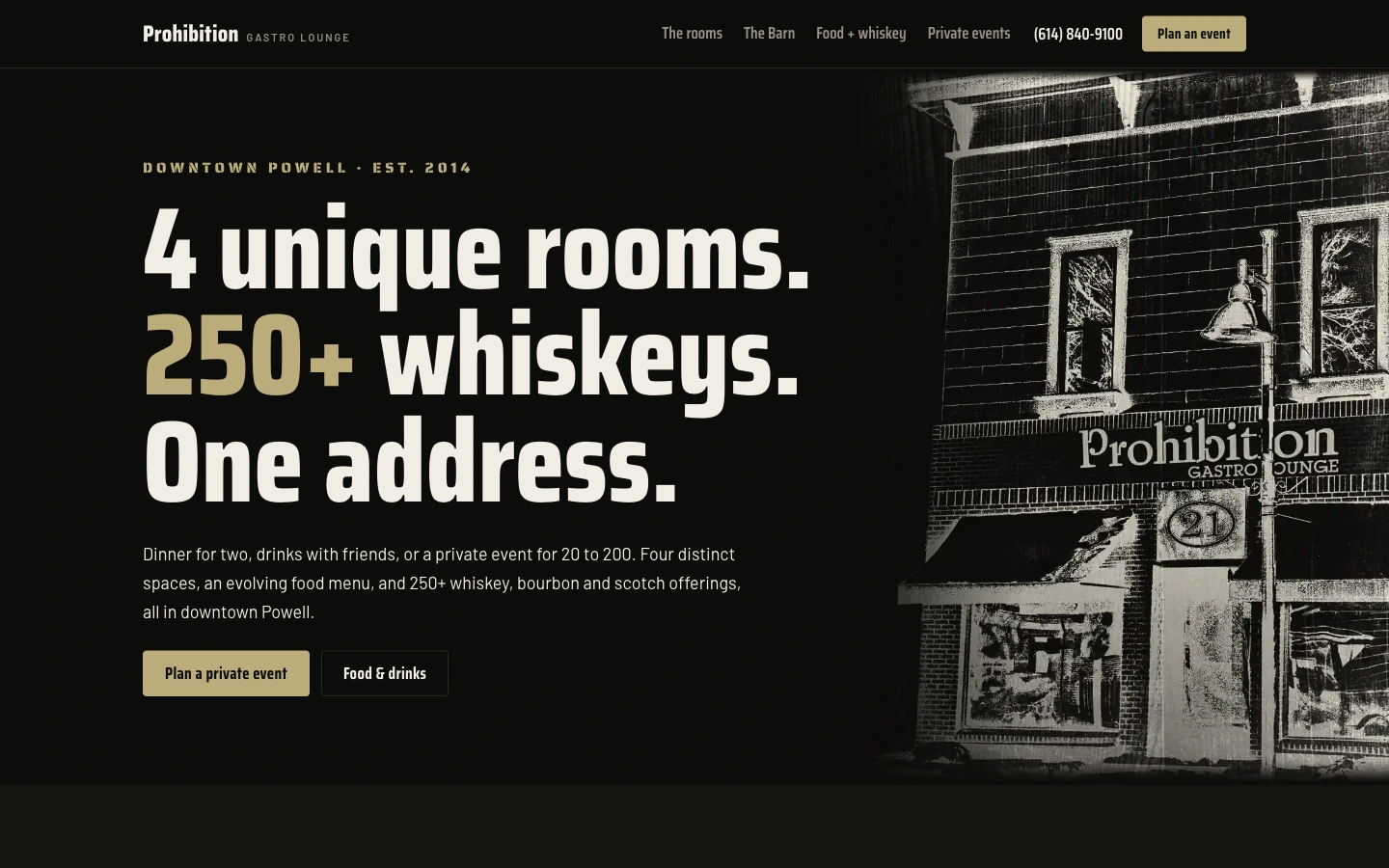
The illustrated exterior, near-black palette and warm gold type give the opening a distinct sense of place. The main message connects the rooms, drinks and address. The visual identity has more specificity than a generic cocktail photograph.
02

Explain how the spaces differ

The room presentation and group-size guidance help visitors compare settings. The Barn and private-event content have their own role alongside food and drinks. A planner can investigate fit without confusing a large event with an ordinary dinner reservation.

03

Offer two useful starting points

Plan a private event and Food & drinks separate the main visitor intentions. The rest of the content develops those routes with room and menu detail. Contact information remains visible for someone who already knows what they need.

Designed for the small screen

A strong sense of place, then a simple choice.

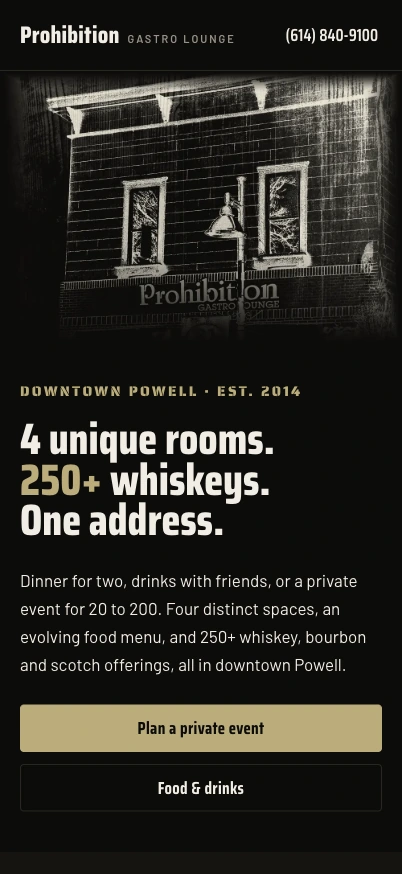
The building illustration becomes a prominent opening panel on mobile. The main message follows with two stacked actions for events and dining. The phone link stays in the compact header, supporting a direct conversation without competing with the page’s story.

Explore Prohibition

A better place to start

Build the next stage
of your business.

A custom application, an AI workflow or a distinctive website. Talk directly with Mic about the work you have in mind.

Discuss a project

Or assess your public presence first

Free Marquee Recon. No card. Saved in your private account.