Back to gallery

Hospitality / Local destination

Two Rivers

Make the changing menu a reason to come back.

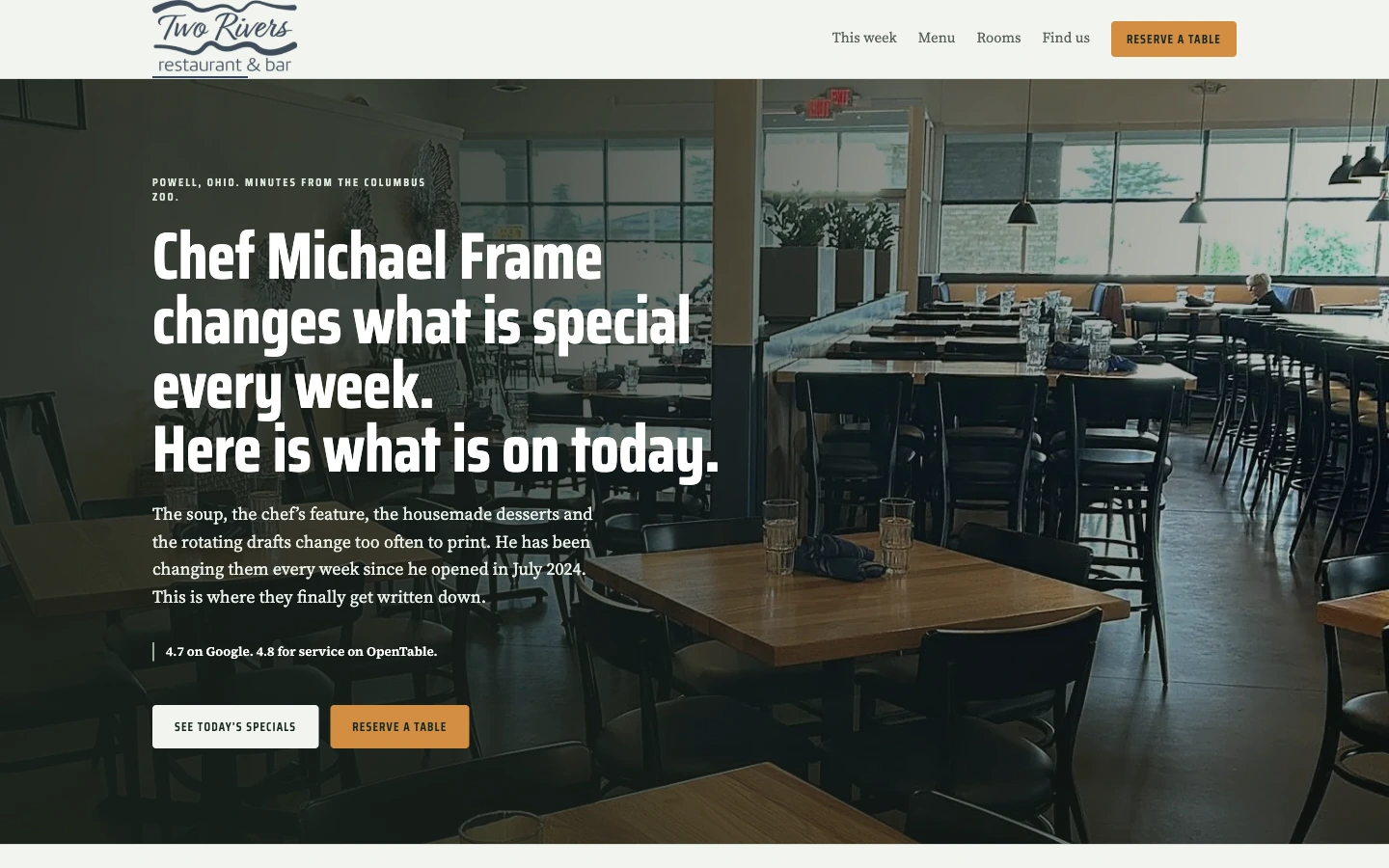
Two Rivers homepage in a MacBook Pro display

The starting point

A website built around
the customer’s decision.

A neighborhood restaurant’s most useful information changes regularly. This design concept puts the current food story at the center while keeping reservations, menus and directions accessible.

The thinking behind the design

Details with a purpose.

01

Lead with what is happening now

The opening focuses on the chef’s weekly changes rather than a timeless generic restaurant slogan. Dining-room photography grounds the message in the actual setting. Strong type gives the current offer a clear place in the visual hierarchy.
02

Build the page around recurring visits

This week and the full menu have different roles. One supports a returning guest looking for something new; the other helps a first-time visitor understand the restaurant. Rooms and location information broaden the site beyond the immediate meal.

03

Keep the table reservation close

See today’s specials and Reserve a table are paired as the main actions. A visitor can inspect the current offering or move toward a booking. The navigation maintains that relationship between useful food information and a practical next step.

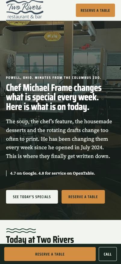
Designed for the small screen

Current specials and a table are easy to find.

The mobile page keeps the dining-room image behind a readable message and fits both main actions into the opening. Reservation and phone access also appear in the bottom bar. The weekly content continues immediately below, making the page useful for a returning guest.

Explore Two Rivers

A better place to start

Build the next stage
of your business.

A custom application, an AI workflow or a distinctive website. Talk directly with Mic about the work you have in mind.

Discuss a project

Or assess your public presence first

Free Marquee Recon. No card. Saved in your private account.