Back to gallery

Hospitality / Food & drink

Macelleria

Make the craft of the butcher the reason to visit.

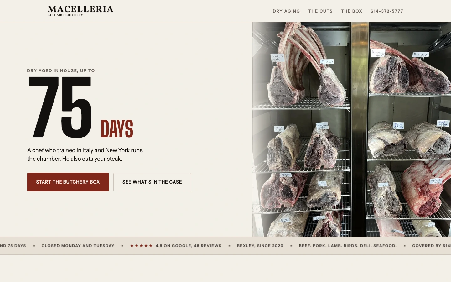
Macelleria homepage in a MacBook Pro display

The starting point

A website built around
the customer’s decision.

A specialty butcher has more to communicate than a product category. The site needs to show the work, explain the expertise and help someone choose between visiting, ordering and planning a larger occasion.

The thinking behind the design

Details with a purpose.

01

Use the process as the visual hook

The dry-aging chamber and prominent aging-time treatment make the opening specific to the business. Strong condensed type, cream backgrounds and a deep red accent echo a butcher-shop character. The imagery shows the craft rather than a generic plated meal.
02

Give different buying needs their own place

The butcher box, current cuts, chef story and private-event information create distinct paths. A visitor can learn about the product or move toward a recurring order. That structure allows the business to communicate more than its retail location.

03

Bridge interest and an actual visit

Hours, location and phone details support a practical next step. The opening actions distinguish starting a butcher box from seeing what is available. The customer can act on the story without first working out how the shop sells.

Designed for the small screen

Strong character, organized one decision at a time.

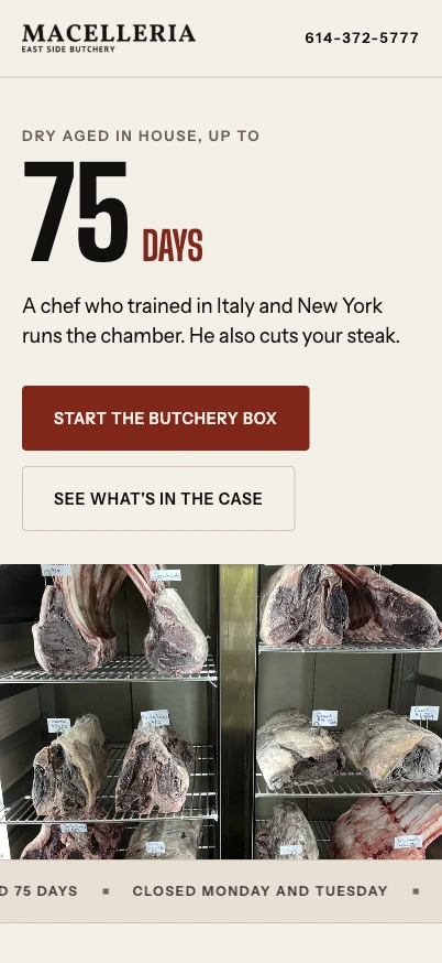
The mobile page stacks the proposition, product actions and chamber imagery. Large type keeps the central idea recognizable, while full-width buttons make the two main buying routes easy to distinguish. Contact information stays close to the compact brand header.

Explore Macelleria

A better place to start

Build the next stage
of your business.

A custom application, an AI workflow or a distinctive website. Talk directly with Mic about the work you have in mind.

Discuss a project

Or assess your public presence first

Free Marquee Recon. No card. Saved in your private account.